TL;DR
Context
Lynk is a B2B SaaS platform for contract management. It helps organizations centralize, review, and monitor long-term agreements by highlighting key details such as risks, obligations, deadlines, and financial terms. This enables legal teams to maintain clarity, reduce manual review time, and minimize financial risk across their contract portfolio.
Pain
Users rarely used labels, and when they did, they were often applied incorrectly. Many mixed up snippet labels, document-level labels, and comments, leading to inconsistent data. As a result, users didn’t trust the labels and always double-checked the document manually.
Outcome
Redesigned and enhanced the Annotator with a new labeling flow, snippet references, and label templates per document type, making contract annotation faster and more intuitive.
Timeline
12 Weeks (Nov 2023 - Feb 2024)
Team
Product Designer
Product Manager
Fullstack Developer
Backend Develoeper
Impact
5x faster contract labeling time (from 15 to 3 min)
30% increase in correct annotation usage
Reduction in misapplied labels and comments
Fewer complaints about labeling usage
BEFORE

AFTER

How we understood the problem
This project began with a strategic session where we mapped out product feedback and analyzed real product usage. We reviewed how labels and comments were being applied, counted how many were incorrectly used, and identified the reasons behind those mistakes. These insights helped us clarify the underlying issues, define the key design challenges, and map out the ideal labeling workflow.


Design Challenges
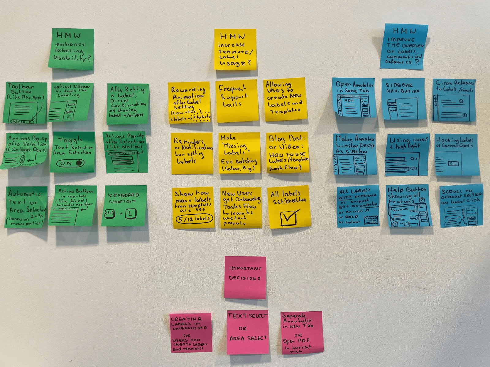
How might we make the labeling process more intuitive and efficient, so users can easily assign labels to important contract details with minimal effort?
→ Why? Users currently use labels infrequently and incorrectly, leading to numerous support issues. An intuitive product could increase Lynk's usage and effectiveness.How might we encourage users to use templates and ensure that all expected labels are applied?
→ Why? The strength of Lynk lies in its labeling functionality, and maximizing this feature will help users get the most out of the platform.How might we provide users with a clear and cohesive overview of labels, comments, and references within a document?
→ Why? A clear overview will aid in locating important information and contribute to an easier navigation of the platform’s features.
Defining the ideal solution
In the strategy session, we mapped out the ideal (high-level) user flow as follows:
Select Document Template by choosing a document type.
Fill in Missing Labels and Summarize Important Information.
Review Labels for accuracy and completeness.

Exploration & prototyping

Before diving into the UI design, I explored potential solutions through a brainstorming session. This session focused on identifying possible interactions to be used in the prototypes. The three design challenges formulated in Phase 1 served as the starting point for this brainstorming.
The ideas and solutions generated were later discussed with the team and served as inspiration for the final designs. I created interactive prototypes to test new product ideas and validate these concepts.
Testing & Iterating
To determine if the changes in the design were genuinely valuable improvements, we conducted usability tests. We invited four end-users to test the prototypes, allowing us to make adjustments based on their feedback and observations after each session. The usability tests were recorded and thoroughly analyzed in Dovetail. This enabled us to focus on observations such as facial expressions, mouse movements, and other non-verbal cues that are often missed during live testing. All observations were summarized through quotes and short video clips, and the insights gained were used to iterate and refine the design.
Adding labels or comments to a specific highlight (snippet) has become easier with the new feature that displays a popup immediately when you select a text area.

Users are nudged to select document templates as the button is highlighted in orange, allowing them to immediately fill in any missing labels.


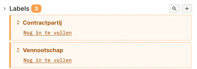
The sidebar provides an overview of all labels and comments, along with their corresponding snippets. This makes it easier to locate information and allows for direct verification of the relevant source location. Comments now have their own dropdown menu and are separated from labels to reduce complexity.

Solution
After multiple iterations, testing rounds, and cross-team collaboration, the redesigned Annotator delivered a clearer, faster, and more reliable labeling experience. The guided flow, snippet-backed verification, and preset labels per document type significantly improved usability and trust. As a result, contract labeling became 5× faster (from 15 to 3 minutes), correct annotation usage increased by 30%, and misapplied labels and comments dropped. Pilot users processed more documents with fewer questions, and complaints about labeling decreased noticeably across support and customer feedback.


